Theming
MimiSDK has a powerful theming engine built into every UI component, designed to provide all the flexibility you need to make Mimi feel at home in your app. We provide the ability to customize colors, fonts, layout and system elements and more.
Applying a theme
Applying Mimi's theme is as simple as using it in your app's manifest:
If you want to theme UX resources with your UI stylesheet, then you need to declare a theme in your app's styles.xml and make it extend Theme.Mimi. Then you will be able to override as many attributes as needed, as a way to customize colors, text fonts or even button shapes:
<style name="MyBrandTheme" parent="Theme.Mimi">

        <!-- general colors -->

        <item name="mimiPrimaryTintColorNormal">@color/myPrimaryTintColor</item>
        <item name="mimiPrimaryTintColorHighlighted">@color/myPrimaryTintColorHighlighted</item>
        <item name="mimiSecondaryTintColorNormal">@color/mySecondaryTintColor</item>
        <item name="mimiSecondaryTintColorHighlighted">@color/mySecondaryTintColorHighlighted</item>
        <item name="mimiTertiaryTintColorNormal">@color/myTertiaryTintColor</item>
        <item name="mimiTertiaryTintColorHighlighted">@color/myTertiaryTintColorHighlighted</item>

        <item name="mimiPrimaryTextColorNormal">@color/myPrimaryTextColor</item>
        <item name="mimiPrimaryTextColorHighlighted">@color/myPrimaryTextColorHighlighted</item>
        <item name="mimiSecondaryTextColorNormal">@color/mySecondaryTextColor</item>
        <item name="mimiSecondaryTextColorHighlighted">@color/mySecondaryTextColorHighlighted</item>

        <item name="mimiForegroundColorNormal">@color/myForegroundColor</item>
        <item name="mimiForegroundColorHighlighted">@color/myForegroundColorHighlighted</item>
        <item name="mimiSecondaryForegroundColorNormal">@color/mySecondaryForegroundColor</item>
        <item name="mimiSecondaryForegroundColorHighlighted">@color/mySecondaryForegroundColorHighlighted</item>

        <item name="mimiPrimaryBackgroundColor">@color/myPrimaryBackgroundColor</item>
        <item name="mimiSecondaryBackgroundColor">@color/mySecondaryBackgroundColor</item>
        <item name="mimiElevatedBackgroundColor">@color/myElevatedBackgroundColor</item>

        <item name="mimiWarningColor">@color/myWarningColor</item>
        <item name="mimiErrorColor">@color/myErrorColor</item>

        <!-- fonts -->

        <item name="mimiFontLight">@font/myFontLight</item>
        <item name="mimiFontRegular">@font/myFontRegular</item>
        <item name="mimiFontMedium">@font/myFontMedium</item>
        <item name="mimiFontHeader">@font/myFontHeader</item>

        <!-- text appearances -->

        <item name="mimiTextAppearanceHeader">@style/myHeaderText</item>
        <item name="mimiTextAppearanceBodyNormal">@style/myBodyNormalText</item>
        <item name="mimiTextAppearanceBodyHighlighted">@style/myBodyHighlightedText</item>
        <item name="mimiTextAppearanceCompactBodyNormal">@style/myBodyCompactText</item>
        <item name="mimiTextAppearanceCompactBodyHighlighted">@style/myBodyCompactHighlightedText</item>
        <item name="mimiTextAppearanceTitle">@style/myTitleText</item>
        <item name="mimiTextAppearanceAction">@style/myMimiActionText</item>
        <item name="mimiTextAppearanceCompactAction">@style/myMimiActionCompactText</item>
        <item name="mimiTextAppearanceCaption">@style/TextAppearance.Mimi.Caption</item>

        <!-- widget styles -->

        <item name="mimiButtonCornerRadius">@dimen/myButtonRadius</item>
        <item name="mimiButtonStyle">@style/myButtonStyle</item>
        <item name="mimiCompactActionButtonStyle">@style/myCompactActionButtonStyle</item>
        <item name="mimiCompactBorderlessActionButtonStyle">@style/myCompactActionButtonBorderlessStyle</item>

        <!-- specialized theming -->
        <item name="mimiHearButtonStyle">@style/myHearButtonStyle</item>
        <item name="mimiLauncherCardCornerRadius">@dimen/myLauncherCardCornerRadius</item>
        <item name="mimiSoundPersonalizationIconColor">@color/mySoundPersonalizationIconColor</item>

        <!-- Note: Deprecated attributes are not shown -->
</style>
Note: In order to properly theme your Mimi components, you will need to make use of the Theme.Mimi style class. You can either do this by theming the whole application with such a theme like shown above or you can also theme any Activity independently by specifying the MimiUX theme per Activity in your application Manifest.
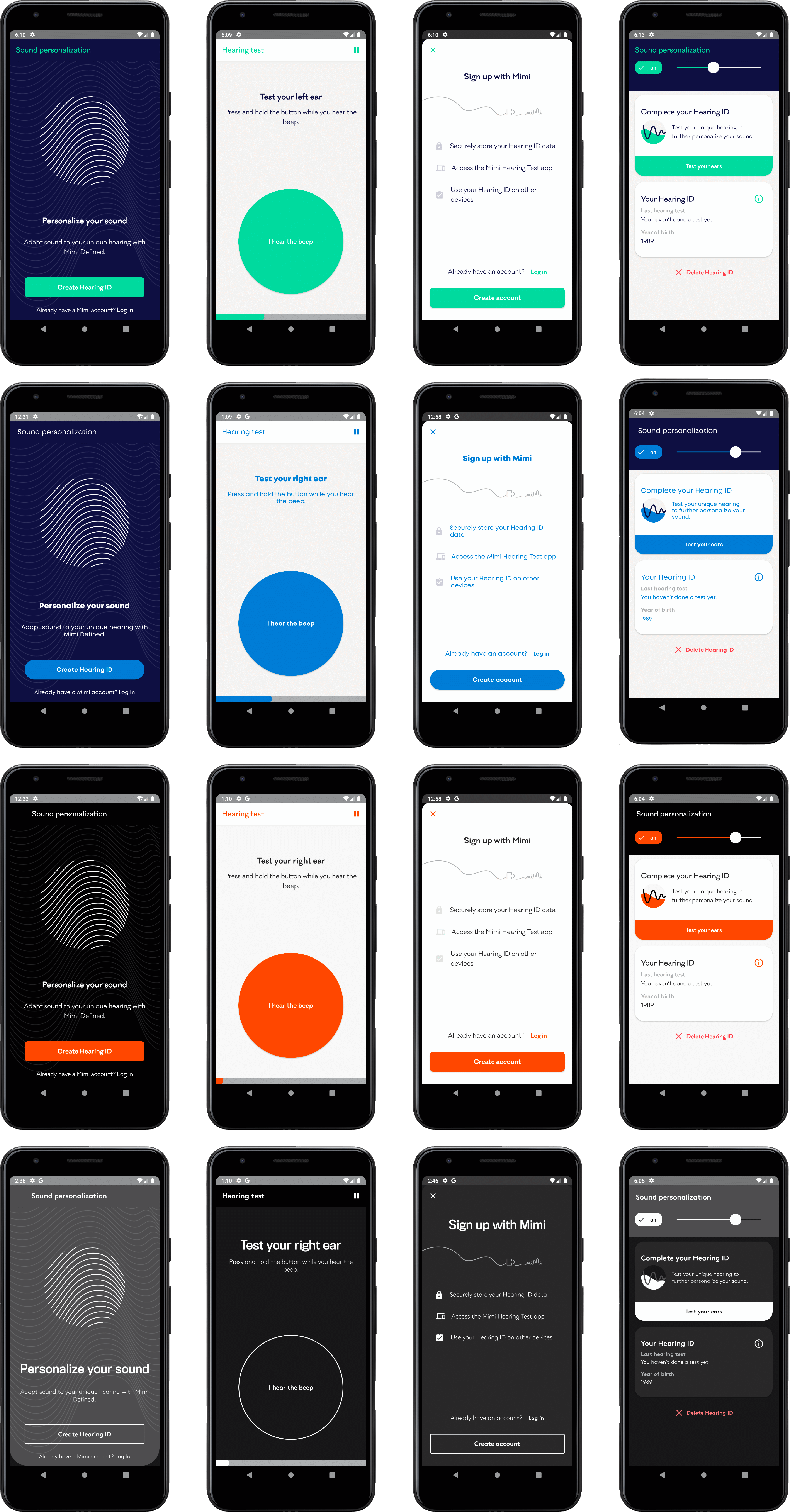
Color identifiers
primaryTint
The Primary color that is applied to buttons, navigation titles, switches, sliders and artwork.
secondaryTint
Secondary tint that is applied to secondary elements, designed to give contrast to the primaryTint.
tertiaryTint
Tertiary tint that is applied to mostly background elements, such as separators and control backgrounds.
foreground
Color that is used as the foreground in controls and views, such as for the text color in buttons or switches with a colored background.
primaryBackground
Background color that is applied to all full-screen views, excluding overlay modals that do not cover the entire canvas.
secondaryBackground
Background color that is applied to some secondary views, and should give contrast to the primaryBackground.
elevatedBackground
Background color that is applied to elements that are commonly found above the primary background canvas, such as navigation bars, dialogs, tab bars and modal overlays.
primaryText
Text color that is applied to all primary text, such as primary information labels and text fields.
secondaryText
Text color that is applied to low priority text elements, such as background information and details.
warning
Color to use for alerts that are presented for non-fatal errors.
error
Color to use for alerts that are presented for fatal errors.
Font attributes
header
Font to use for large titles, typically seen as large, prominent headers. Also used by default on the mimiTextAppearanceHeader text style.
regular
Font to use for title elements, such as navigation bar titles as well as Edit texts. Used by default on the mimiTextAppearanceTitle text style.
medium
Font to use for highlighted versions of body text elements, which are typically emboldened. Used by default on the mimiTextAppearanceBodyHighlighted, mimiTextAppearanceAction and mimiTextAppearanceCompactBodyHighlighted.
light
Font to use for all body text elements.
Button and Launcher Card styles
Button
Default button style using primaryTintColor as background color, foregroundColor as text color and mediumFont as family font.
CompactActionButton
More compressed action button style, with less padding designed for quicker and more usual flow actions. Also styled using primaryTintColor as background color and foregroundColor as text color.
CompactBorderlessActionButton
Similar to CompactActionButton but without any background color and styled with primaryTintColor as text color.
MimiHearButtonStyle
Main button style for the Circular Button present inside the Hearing Test. Styled by default with primaryTintColor as background color, foregroundColor as text color and mediumFont as family font.
Launcher Cards
Besides the color and font styles, one can also customize the card corner radius size by overriding the mimiLauncherCardCornerRadius parameter. Default Mimi value is set to 24dp.